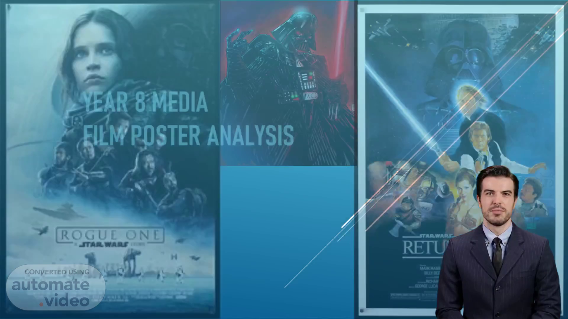
Year 8 Media Film poster Analysis
Scene 1 (0s)
[Virtual Presenter] Welcome everyone to this presentation. We will be exploring the similarities and differences between two different Star Wars movie posters for the original trilogy and Rogue One. We will look at the use of images, film titles, and production blurbs and how they are used to draw attention to the movie. Let's get started!.
Scene 2 (21s)
[Virtual Presenter] Whilst researching for this presentation, I examined two notable films from the 'Star Wars' universe: Return of the Jedi from the original trilogy, and Rogue One from the new trilogy. The purpose of the analysis was to compare the two films, and to observe the approaches taken by their respective posters. In particular, I considered the differences between the older and newer styles of poster production. Taking a closer look, the posters appear to be similar in some ways, yet very different in others. From the visuals, to the text, to the appeal of the posters, the differences are both interesting and entertaining. This project aims to increase your understanding and appreciation of movie posters..
Scene 3 (1m 6s)
[Audio] A visual representation of a film poster is shown on this slide. The main image is the most dominant element as it communicates the essence of the film, while the film title is another important part of the poster as it is used to identify the film. The production blurb, a short description of the film, concludes this analysis and helps introduce it to the audience..
Scene 4 (1m 29s)
[Audio] Analyzing this movie poster, we can uncover a lot of vital information. The title and main image are the most prominent elements, emphasizing the focus of the movie. The imagery of the AT-AT droid, star destroyer and other characters alludes to an action-packed and exciting movie. The production blurb provides details about the production team and co-starring actors, giving us a good insight into the movie and its makers..
Scene 5 (1m 58s)
[Audio] The poster for Rogue One clearly displays two important elements to its audience. The title is prominently centred and large, making sure viewers won't miss it. Likewise, the image of the characters is centred and stands out due to its size and colour. These two features successfully communicate the movie's title and genre of sci-fi warfare. The poster's overall layout is thoughtfully simple yet effective..
Scene 6 (2m 27s)
[Audio] Rogue One poster shows an effective layout and design with its bold white title and light planet standing out against the characters. This contrast evokes a sense of adventure and the text alludes to award-winning movies and features famous actors. All these elements make the poster an effective marketing tool for this unique movie..
Scene 7 (2m 49s)
[Audio] Taking a look at the elements in this slide, there is a main image, a film title, another image and a production blurb. Generally, these components come together to form a strong image that highlights the main ideas and subject matter of the film. When evaluating a film poster, it's essential to analyze how the particular elements bring out the desired impression..
Scene 8 (3m 12s)
[Audio] The poster includes a main image featuring the Jedi and Sith, as well as other imagery of X-wings and tie-fighters, alluding to action and war. The bold white text of the title conveys the idea of the Jedi bringing peace. At the bottom is a production blurb with the co-starring actors, companies involved in production, and the production team of the movie. Its placement and size of font suggest its importance, but not as much as the title and images. This information provides an overall understanding of the movie..
Scene 9 (3m 47s)
[Audio] Return of the Jedi poster displays an effective layout, with the title and image of the characters prominently situated in the centre. This ensures viewers immediately recognize the film title and its genre, providing them all the necessary information to know what the movie is about and fueling their desire to watch it. The two biggest features are cleverly placed to draw viewers' attention and quickly allow them to remember the film title. A simple yet effective design..
Scene 10 (4m 16s)
[Audio] The poster for Star Wars: Return of the Jedi is an effective advertisement that conveys the title and story line of the movie. Bold, white text and mechanical vehicles signify action and war, hinting at the sci-fi experience to come. The second image provides a glimpse of the excitement and drama that the movie has to offer, while the text alludes to its award-winning nature and respected actors, making it a must-watch..
Scene 11 (4m 45s)
[Audio] From this analysis, both posters are effective in visibly conveying the genre of Sci-Fi. From the colors, the text, and the imagery, each poster speaks to the story it is trying to tell. In terms of effectiveness in advertising, both posters are memorable, yet the imagery of Rogue One is particularly more memorable than Return of the Jedi. Having characters and machines that are recognizable helps viewers recall the details of the film and may help achieve better advertising.Thank you for your attention..