SCATTER DIAGRAM AND ITS TYPES
Scene 1 (0s)
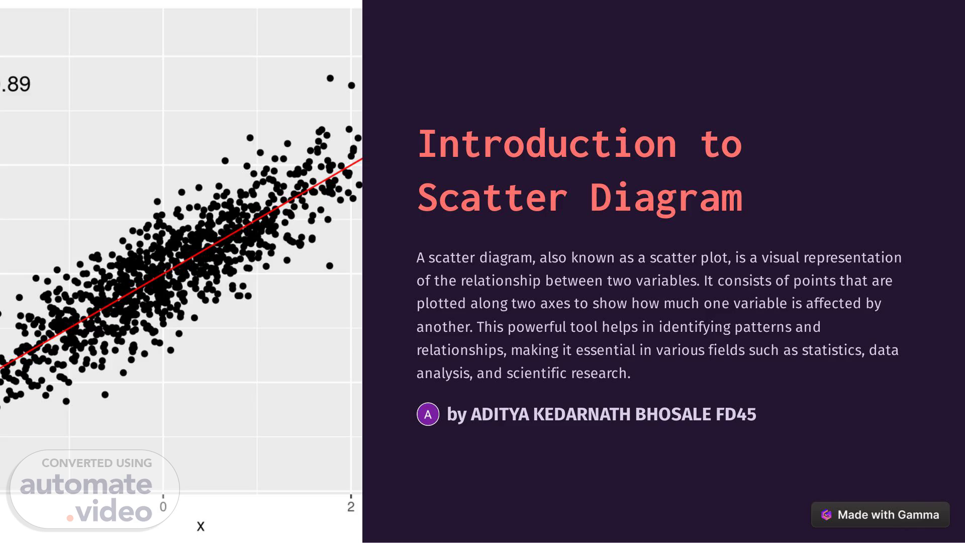
[Audio] Introduction to Scatter Diagram A scatter diagram, also known as a scatter plot, is a visual representation of the relationship between two variables. It consists of points that are plotted along two axes to show how much one variable is affected by another. This powerful tool helps in identifying patterns and relationships, making it essential in various fields such as statistics, data analysis, and scientific research. by ADITYA KEDARNATH BHOSALE FD45.
Scene 2 (33s)
[Audio] Purpose and Benefits of Using Scatter Diagrams Visualizing Relationships Scatter diagrams are used to visually depict the correlation between two variables. This visualization helps in understanding the nature and strength of the relationship, whether it's positive, negative, or neutral. Identification of Outliers Scatter diagrams are effective tools for identifying outliers or anomalies in data. These outliers can have a significant impact on the analysis and decision-making process, making their identification crucial. Data Pattern Recognition By using scatter diagrams, patterns and trends within the data can be identified and studied. This helps in making informed predictions, understanding complex relationships, and deriving meaningful insights from the data..
Scene 3 (1m 25s)
[Audio] Positive Scatter Diagram 1 Strong Correlation In a positive scatter diagram, the points on the plot form an upward trend, indicating a positive correlation between the variables. This suggests that as one variable increases, the other also tends to increase. 2 Linear Relationship The data points in a positive scatter diagram tend to produce a linear pattern, showing a clear and consistent relationship between the variables being studied. 3 Example For example, as the number of study hours increases, the exam scores also increase, demonstrating a positive correlation..
Scene 4 (2m 8s)
[Audio] Negative Scatter Diagram Inverse Correlation A negative scatter diagram displays a downward trend, indicating an inverse correlation between the variables. Here, as one variable increases, the other tends to decrease. Non-linear Patterns Unlike positive scatter diagrams, negative scatter diagrams may exhibit nonlinear patterns, highlighting the inverse relationship between the variables. Illustration For instance, as the outdoor temperature rises, the sales of winter apparel decline, portraying a negative correlation..
Scene 5 (2m 44s)
[Audio] No Correlation Scatter Diagram 1 Scattered Plot A no correlation scatter diagram appears as a random distribution of points, lacking any evident trend or pattern between the variables. 2 Equal Distribution The points are spread evenly across the plot, suggesting little to no relationship between the variables being studied. 3 Example For instance, the height of trees and the number of birds in a park may show no evident pattern when plotted as a no correlation scatter diagram..
Scene 6 (3m 20s)
[Audio] Outliers in Scatter Diagrams 1 Identification Outliers in scatter diagrams are data points that significantly deviate from the general pattern or distribution exhibited by the majority of points in the plot. 2 Influence These anomalies can greatly influence the results and conclusions drawn from the data analysis, thus requiring special attention during interpretation. 3 Importance Understanding and addressing outliers is crucial for accurate decisionmaking, statistical modeling, and forecasting based on the data..
Scene 7 (3m 58s)
[Audio] Interpreting Scatter Diagrams Key Considerations When interpreting scatter diagrams, attention should be given to the direction, form, and strength of the relationship between the variables. Pattern Analysis Various patterns, such as positive linear, negative linear, quadratic, or no correlation, should be carefully analyzed to draw meaningful conclusions. Contextual Understanding Considering the context of the variables and the domain knowledge is essential for accurate interpretation and meaningful insights..
Scene 8 (4m 30s)
[Audio] Conclusion and Key Takeaways Scatter diagrams play a vital role in data analysis, providing a clear visual representation of the relationships between variables. Understanding the different types of scatter diagrams and their interpretations is essential for making informed decisions and drawing meaningful insights from data. Whether it's identifying correlations, recognizing outliers, or interpreting patterns, the knowledge and utilization of scatter diagrams can greatly contribute to the accuracy and depth of analysis across various fields..