A comparison Halloween Vs ted
Scene 1 (0s)
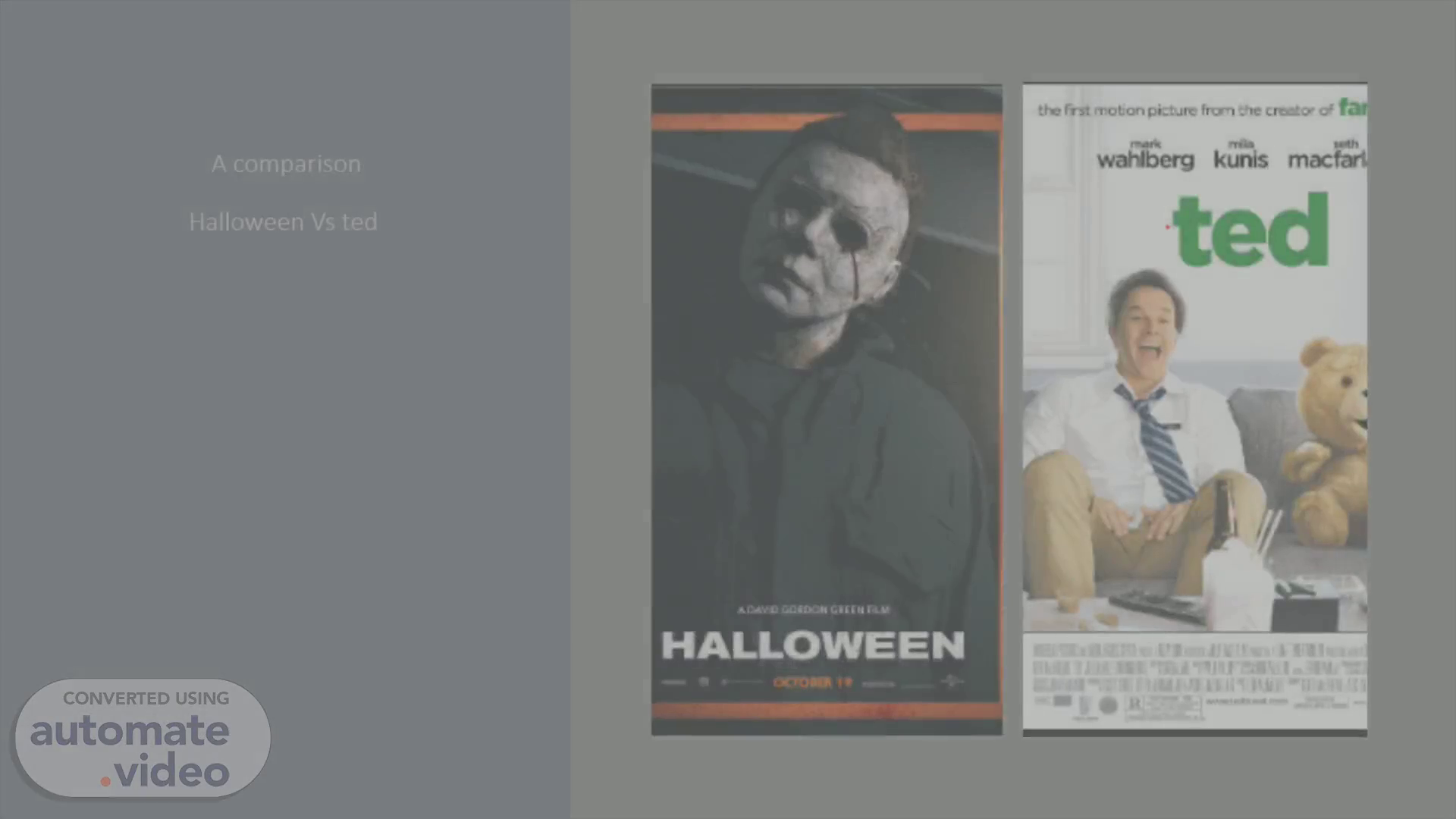
A comparison Halloween Vs ted. HALLOWEEN.
Scene 2 (7s)
Halloween poster. HALLOWEEN exto•en.
Scene 3 (13s)
Halloween poster. HALLOWEEN. The name of the title of the movie.
Scene 4 (33s)
HALLOWEEN. ANALYSIS OF HALLOWEEN CONVENTIONS. The director that made the film to tell the Audience who made the movie and who created the storyline.
Scene 5 (1m 3s)
ANALYSIS OF OVERAL LAYOUT - Halloween. The overall layout of the Halloween poster is simple and effective. The two biggest eye-catching features are the title and the Michle Myers body this is because it is scary and creepy this I why it catches the Audiences eye it also has a dark background . This allows the Audience to see that it is scary because of the character at the front of it and because of the scary title..
Scene 6 (1m 24s)
EVALUATION – Halloween. The Halloween poster is extremely successful poster for a Horror movie. It advertises the title and storyline of the movie well through its layout and colors of the tile and images because of the dark scary colors and the bold text. The bold white ghosted title and the scary dark horror character on the front of this Horror movie poster with all this happening on the poster it gives the Audience a creeped out first impression, and they will be expecting some bloody, goory violence. The text gives the audience to make them want to see the movie because of the white shadowy look but overall, this poster is effective..
Scene 7 (1m 50s)
ted. The title of the movie. The image of the movie.
Scene 8 (2m 0s)
Analysis of conventions- Ted. The two main characters of the movie that makes the movie popular and funny because of these two characters.
Scene 9 (2m 30s)
Analysis of overall – ted poster. The overall effect of this poster Is good and simple because all it is showing is two characters laughing showing that it is going to be a funny movie and it also shows a big large green title saying ted..
Scene 10 (2m 45s)
Evaluation- Ted. The Ted movie poster is good and effective , and also Effective because it is really simple Because it has the two main characters laughing on the poster and it also has a big bold green Ted title for the movie poster. And the background is bright and happy to show the audience that this movie is really happy and a good vibe for the audience..
Scene 11 (3m 5s)
Evaluation comparison of both posters. When considering both of these amazing and effective posters it is clear that you can tell what genre they are by looking at these posters because of the simple things they put into these posters..