Introduction-to-Scatter-Diagram
Scene 1 (0s)
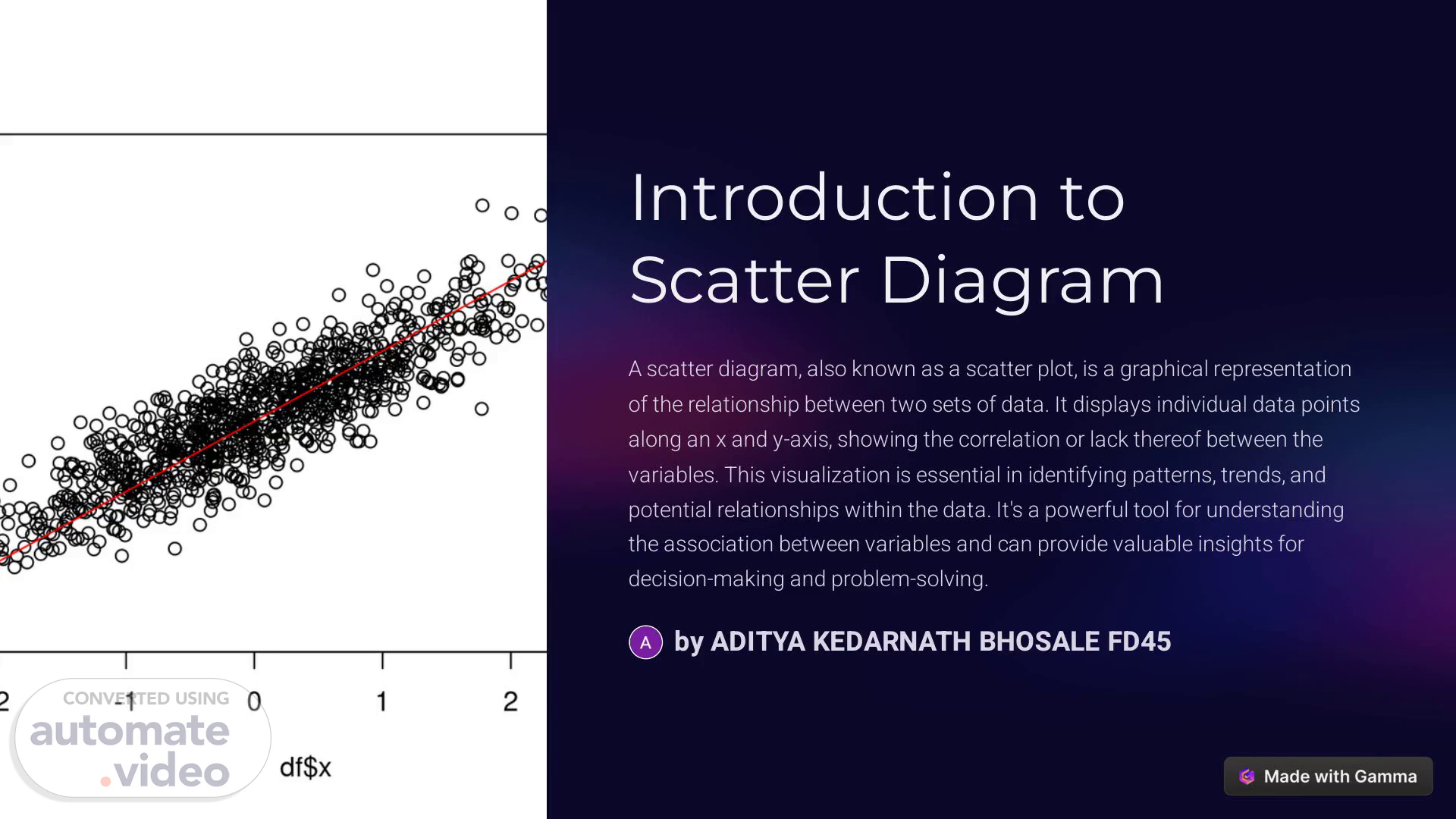
[Audio] Introduction to Scatter Diagram A scatter diagram, also known as a scatter plot, is a graphical representation of the relationship between two sets of data. It displays individual data points along an x and y-axis, showing the correlation or lack thereof between the variables. This visualization is essential in identifying patterns, trends, and potential relationships within the data. It's a powerful tool for understanding the association between variables and can provide valuable insights for decision-making and problem-solving. by ADITYA KEDARNATH BHOSALE FD45.
Scene 2 (40s)
[Audio] Purpose and Benefits of Using Scatter Diagrams 1 Visualizing Relationships Scatter diagrams help visualize relationships between variables, making it easier to identify correlations, trends, clusters, or outliers in the data. This visual representation can reveal valuable insights that might not be apparent from looking at the raw data alone. 2 Identifying Patterns They are used to identify and investigate patterns such as linear or non-linear relationships, positive or negative correlations, and the presence of clusters or outliers. This can aid in making predictions and understanding the behavior of the variables. 3 Validating Hypotheses Scatter diagrams are commonly used in scientific research and experimentation to validate hypotheses and theories. By visually representing the data points, it becomes easier to assess the validity of the proposed relationships between variables. 4 Supporting Decision Making They provide a visual basis for making decisions based on the observed relationships between variables, allowing stakeholders to understand the implications and risks associated with different courses of action..
Scene 3 (1m 59s)
[Audio] Positive Scatter Diagram 1 Strong Positive Correlation In a positive scatter diagram, the data points trend upwards from left to right, indicating a strong positive correlation between the variables. This suggests that as one variable increases, the other variable also tends to increase. 2 Well-Fit Line Positive scatter diagrams often exhibit a well-fit line that accurately represents the relationship between the variables, making it easier to predict future values and trends. 3 Example An example of a positive scatter diagram is the relationship between study hours and exam scores, where increased study hours correlate with higher exam scores..
Scene 4 (2m 47s)
[Audio] Negative Scatter Diagram Strong Negative Correlation A negative scatter diagram shows a downward trend from left to right, indicating a strong negative correlation between the variables. This implies that as one variable increases, the other tends to decrease. Outliers Negative scatter diagrams may contain outliers that deviate significantly from the general trend, highlighting specific data points with unique characteristics or circumstances..
Scene 5 (3m 17s)
[Audio] No Correlation Scatter Diagram 1 Random Distribution A no correlation scatter diagram displays a random distribution of data points with no apparent trend or relationship, suggesting little to no correlation between the variables. 2 Scattered Points The data points are scattered throughout the chart, indicating the absence of a systematic relationship between the variables being studied. 3 Application An example of a no correlation scatter diagram is the relationship between shoe size and intelligence, where no meaningful connection is found..
Scene 6 (3m 56s)
[Audio] Linear Scatter Diagram Clear Trend Line A linear scatter diagram exhibits a clear trend line that showcases a consistent and direct relationship between the variables, often in the form of a straight line. Predictive Value Linear scatter diagrams are valuable for making predictions and extrapolating future trends based on the established linear relationship between the variables. Example An example of a linear scatter diagram is the relationship between distance traveled and time taken, showing a constant speed..
Scene 7 (4m 28s)
[Audio] Non-linear Scatter Diagram 1 Curvilinear Relationships Non-linear scatter diagrams demonstrate curvilinear relationships between variables, showcasing complex patterns that cannot be represented by a straight line. 2 Complex Trends They represent complex trends such as exponential growth, logarithmic decline, parabolic relationships, or other non-linear patterns that defy a simple linear fit. 3 Use Cases Non-linear scatter diagrams are applicable in scenarios where the relationship between variables is more intricate and does not adhere to a linear trend..
Scene 8 (5m 10s)
[Audio] Conclusion and Key Takeaways Scatter Diagrams Types Applications Positive Linear Data Analysis Negative Non-linear Scientific Research No Correlation Decision Making Scatter diagrams offer valuable insights into the relationships between variables and are widely used in various fields including data analysis, scientific research, and decision-making processes. Understanding the different types of scatter diagrams is essential for interpreting and analyzing data effectively..