Scene 1 (0s)
A white background with blue text AI-generated content may be incorrect..
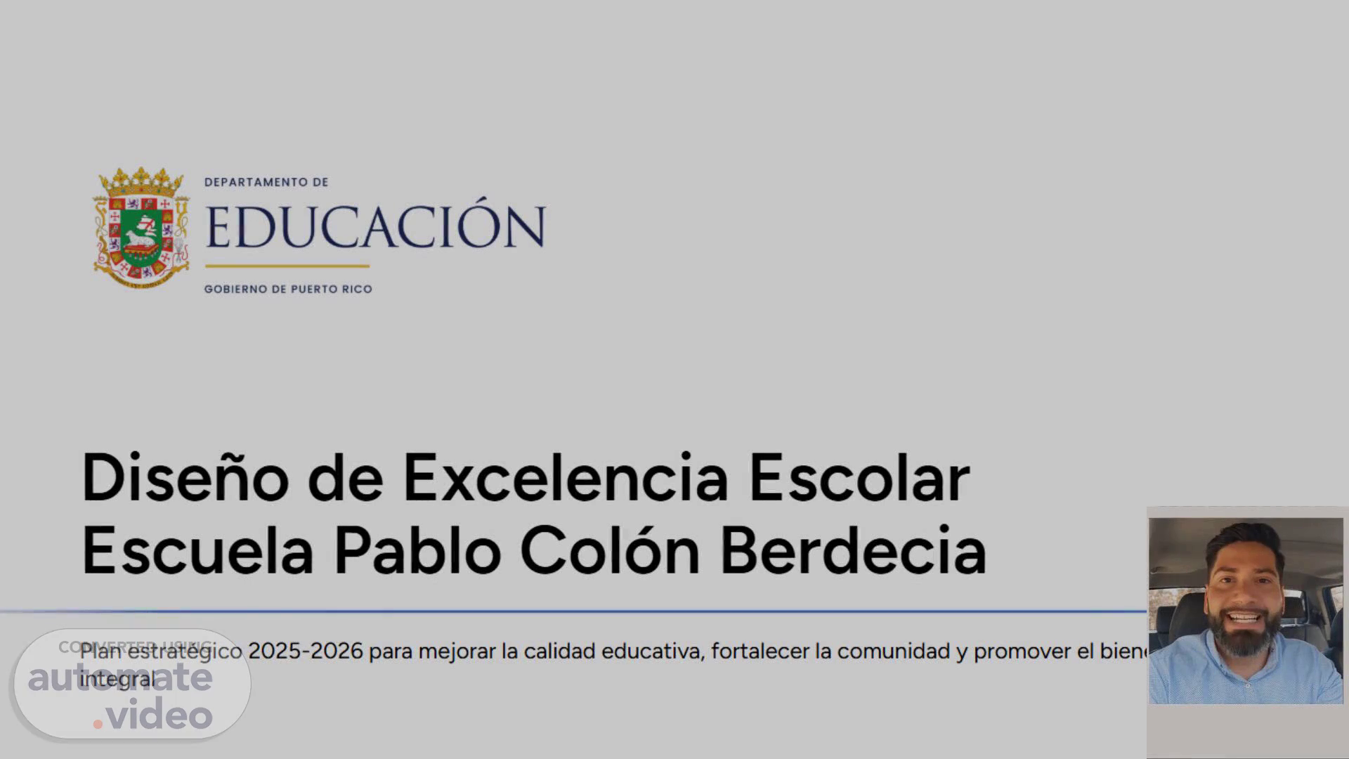
Scene 2 (42s)
[Audio] Today, we will be discussing the importance of using a white background with blue text in presentations. It is essential for teachers in higher education to understand the impact of visual aids on their audience. The combination of a white background and blue text allows for a clean and professional look while providing a pleasing contrast for the eyes. The screenshot of a computer demonstrates how this design creates a visually appealing slide, making it easier to read and keeping the audience focused on the content. When designing slides, remember that less is often more. This combination not only looks aesthetically pleasing, but also effectively conveys your message. The ultimate goal of a presentation is to effectively communicate ideas and information to the audience. By using a white background with blue text, the impact of your message can be enhanced. So, let's keep this in mind as we continue with the rest of the presentation. Now, let's move on to slide number 3..
Scene 3 (1m 45s)
[Audio] In this presentation, we will be discussing slide number 3 out of 11, which focuses on the topic of "A white background with blue text". The slide features a screenshot of a computer with a white background and blue text. The simplicity of this design has a significant impact. The use of white as the background creates a clean and professional look, while the blue text adds a pop of color and draws the audience's attention. This combination results in a visually appealing and easy-to-read slide. In the world of higher education, it is crucial to have visually appealing presentations that effectively convey information to students. This slide serves as an excellent example of how design choices can enhance the overall message of a presentation. It also highlights the importance of carefully choosing colors and backgrounds. Additionally, the use of a white background and blue text can symbolize a sense of stability and trust, which can be helpful when presenting to students who may feel overwhelmed or uncertain. By utilizing these colors, we subconsciously create a sense of reliability and credibility, which helps engage the audience and maintain their attention. In conclusion, the decision to use a white background with blue text is a simple yet powerful choice that can significantly enhance the effectiveness and impact of our presentations. It not only creates a visually appealing slide, but also conveys a sense of stability and trust to our audience. This slide has given insight on the importance of design in presentations in higher education..
Scene 4 (3m 23s)
[Audio] We will now discuss slide number 4 out of 11, which has a white background and blue text. The simple and clean design makes the text easy to read and understand in presentations. In the screenshot, the text is displayed on a computer screen, which is a commonly used format for sharing and viewing presentations. It is crucial to consider the visual aspect of presentations to effectively engage the audience. Moving on to the next slide, always keep design and visual elements in mind when creating presentations..
Scene 5 (3m 57s)
[Audio] Today, we will be discussing the use of a white background with blue text in presentations. This design choice may appear plain, but it is actually a strategic decision. In the fast-paced world of higher education, where we are constantly bombarded with information and visual stimuli, a simple design can help viewers focus on the content. The contrast between the white background and blue text not only looks visually appealing, but also improves legibility. The bright white background makes the text stand out and allows it to be easily read, while the blue color adds a pop of color without being too distracting. Additionally, blue is associated with trust, intelligence, and stability, making it a suitable choice for educational presentations. This adds to the professionalism and credibility of the content. It is also important to consider accessibility when creating presentations, as some viewers may have visual impairments. A white background with blue text is a great option for ensuring all viewers can easily read the content without causing strain on the eyes. In conclusion, using a white background with blue text is a strategic and effective choice for presentations, improving legibility, adding a touch of professionalism, and promoting accessibility. Thank you for listening and I hope you have gained a better understanding of the design choices behind this slide. Let's move on to the next one..
Scene 6 (5m 26s)
[Audio] Slide number six has a simple white background with blue text, which serves an important purpose. White background with blue text is the most readable and visible combination, making it effective for presenting information. The contrast between the colors creates a clean and professional look, and the design choice was made deliberately. This is just one example of how design can enhance a presentation's impact. Let's continue exploring our design choices on the next slide..
Scene 7 (5m 55s)
[Audio] This slide discusses the use of a white background with blue text and its importance. The screenshot shows how this color scheme can improve visual appeal and readability. The strong contrast between the two colors makes the text stand out and is particularly useful in educational settings, enhancing the learning experience for students. In addition, the white background and blue text combination is also easier on the eyes and reduces strain and fatigue, making it a practical choice for presentations. Whether designing a presentation or creating a document, it is recommended to use a white background with blue text for a clean and effective look.".
Scene 8 (6m 35s)
[Audio] In this presentation, we will be discussing slide number 8 out of 11, which features a white background with blue text. As a teacher in Higher Education, it is important to understand the power of effective visual aids in presentations. This slide showcases a simple yet impactful design, with the white background serving as a clean and neutral canvas and the blue text bringing attention to important information. The contrast between the two colors ensures readability and emphasizes the text. This slide also includes a screenshot of a document, adding a visual element to the information being presented. Visual aids like this can engage the audience and make the content more memorable. As educators, it is our responsibility to create impactful presentations that effectively convey our message. This slide is a great example of how a simple design can enhance the overall presentation. Let's move on to the next slide..
Scene 9 (7m 35s)
[Audio] We will now discuss slide number 9, which is titled 'A White Background with Blue Text'. This slide contains a blue and white diagram with accompanying text. As we have seen in previous slides, color plays a significant role in the overall impact of a presentation. In this case, the white background creates a clean and minimalist aesthetic, while the blue text adds a striking contrast and captures the viewer's attention. As a teacher in Higher Education, it is important to understand the visual impact of colors to effectively convey our message. Let's continue exploring the rest of the presentation to see how color can enhance the effectiveness of our visual aids..
Scene 10 (8m 17s)
[Audio] On this slide, we have a white background with blue text which features a screenshot of a computer screen. Visual aids are key in enhancing the audience's understanding and retention of information, as previously discussed. The high contrast of the blue text on the white background draws attention to the important information on the screenshot, making it particularly useful for distant or smaller screens. It is important that our visuals are clear and legible, and the clean and crisp look of the blue text on the white background allows for easy readability even from a distance. This is especially crucial in a higher education setting where complex information is being presented. The purpose of a presentation is to communicate and educate the audience, and a strong visual aid, such as this screenshot, can reinforce the message and keep the audience engaged. The next slide will demonstrate how to add depth and interest to our visuals, so let's keep this in mind as we continue the presentation..
Scene 11 (9m 20s)
[Audio] As our presentation comes to a close, I would like to address the significance of visual design. The eleventh slide has a white background with blue text, a timeless and successful combination. This straightforward design decision has the ability to significantly enhance the legibility and attractiveness of our content. While it may seem like a small detail, it can greatly influence the overall comprehension and retention of the information for our audience. So, when creating your own presentations, keep in mind the influence of a well-designed slide and the impact it can have on your message. Thank you for your attentive presence throughout this presentation, and I hope you have found it informative and beneficial..