Scene 1 (0s)
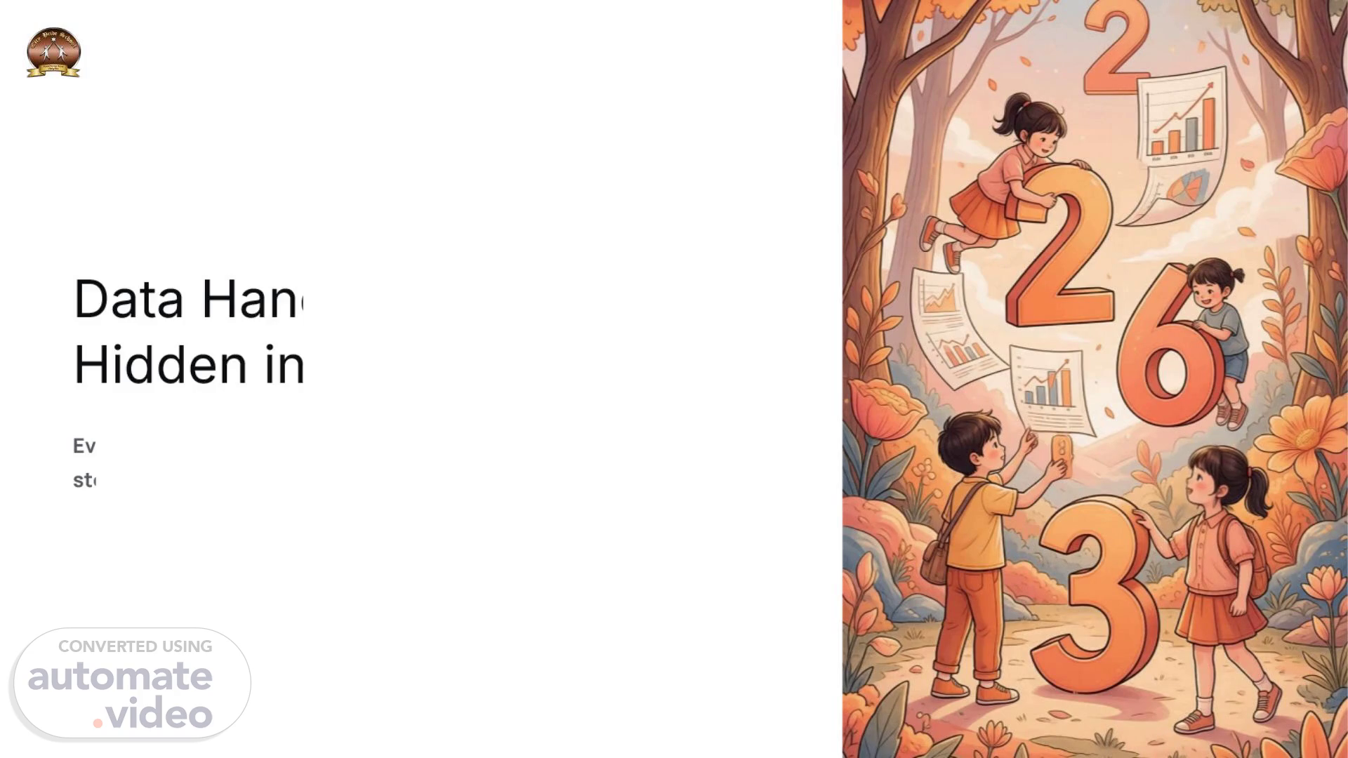
Data Handling: Stories Hidden in Numbers. Every number has a story. Today, we will learn how to read those stories and become data detectives!.
Scene 2 (28s)
[Audio] What do you think about learning data handling skills? Do you have any personal experiences with data handling that you would like to share? Please provide examples from everyday life..
Scene 3 (50s)
[Audio] Example: "The sun rises in the east.". ooo.
Scene 4 (1m 10s)
[Audio] The process of collecting data involves several steps that require attention to detail and care. To begin with, one must identify the type of data needed for the study. This could be anything from demographic information to specific behaviors or events. Once identified, the next step is to determine the methods used to collect the data. These methods include surveys, interviews, observations, and experiments. The choice of method depends on the nature of the data and the goals of the research. For example, if the goal is to understand human behavior, observational studies may be more effective than other methods. Similarly, if the goal is to measure physical properties, experiments would be more suitable. The methods used should also consider the limitations and constraints of each method..
Scene 5 (1m 57s)
[Audio] Organizing data makes it easy to understand, helps us compare quickly, prevents confusion, and saves time. Just like arranging books on a shelf, where everything has its place, our data should also be neat and organized. In this way, we can easily access and compare different pieces of information. By doing so, we can avoid confusion and make the most of our time. Organizing data allows for quick comparison and understanding of various pieces of information. A well-organized system enables us to find specific data with ease, reducing the likelihood of confusion and saving valuable time. The benefits of organizing data are numerous, including improved productivity and reduced errors. Furthermore, an organized database facilitates efficient retrieval and analysis of data, making it easier to draw meaningful conclusions..
Scene 6 (2m 49s)
[Audio] "Understanding Tally Marks The basic rule is simple - four vertical lines plus one slant line equals five. Let's look at some examples. Seven students like oranges, which can be represented as |||| ||. Twelve students like cricket, which can be represented as |||| |||| ||. Now let's practice counting these tallys. Can you count these tallys? |||| |||| |||. The total number of students who like oranges and cricket is fifteen. If we add the number of students who like oranges and those who like cricket, we get fifteen. This means that the number of students who like both oranges and cricket is ten. We can also represent this information using tally marks. Here are the tally marks for oranges and cricket: |||| || || ||. And here are the tally marks for the total number of students who like oranges and cricket: |||| || || ||. As you can see, the two sets of tally marks have a common element - the first set has seven tallies and the second set has twelve tallies. The difference between them is five. This means that the number of students who like both oranges and cricket is five. Therefore, the correct answer is not fifteen but five.". Here is the rewritten text: The basic rule is simple - four vertical lines plus one slant line equals five. Let's look at some examples. Seven students like oranges, which can be represented as |||| ||. Twelve students like cricket, which can be represented as |||| |||| ||. Now let's practice counting these tallys. Can you count these tallys? |||| |||| ||. The total number of students who like oranges and cricket is fifteen. If we add the number of students who like oranges and those who like cricket, we get fifteen. This means that the number of students who like both oranges and cricket is ten. We can also represent this information using tally marks. Here are the tally marks for oranges and cricket: |||| || || ||. And here are the tally marks for the total number of students who like oranges and cricket: |||| || || ||. As you can see, the two sets of tally marks have a common element - the first set has seven tallies and the second set has twelve tallies. The difference between them is five. This means that the number of students who like both oranges and cricket is five. Therefore, the correct answer is not fifteen but five..
Scene 7 (5m 23s)
[Audio] The pictograph shows the number of students who like each fruit. The pictograph has three different fruits, which are apple, banana, and mango. The pictograph also includes a key that explains how to read it. The key tells us that the symbol represents two students. The pictograph then shows six apples, four bananas, and eight mangoes. This means that there are six students who like apples, four students who like bananas, and eight students who like mangoes. The pictograph is useful for showing large amounts of data in a simple way. It can be used to compare the popularity of different fruits among students..
Scene 8 (6m 4s)
[Audio] The pictograph shows the favourite fruits of students. The title says "Favourite Fruits". One apple represents 2 students, two apples represent 4 students, three apples represent 6 students, and so on. There are 5 pictures in total - 3 apples, 2 bananas, and 0 mangoes. Since one apple represents 2 students, 3 apples will represent 6 students. Similarly, 2 bananas will represent 4 students. But there are no mangoes, so they represent 0 students. Therefore, the actual number of students who like each fruit is 6 for apples, 4 for bananas, and 0 for mangoes. The most liked fruit is apples, followed by bananas. The least liked fruit is mangoes. The most liked fruit is apples, and 6 students chose it..
Scene 9 (6m 59s)
[Audio] Bar graphs are used to represent data in the form of vertical bars of varying lengths, where the height of each bar corresponds to the magnitude of the data value it represents. The horizontal axis typically displays categories or labels, while the vertical axis indicates the scale or units of measurement. In this type of graph, the length of each bar is proportional to the value it represents, allowing for easy comparison and visualization of large datasets. By using colors to differentiate between the bars, bar graphs enable users to quickly identify trends, patterns, and relationships within the data. This visual representation facilitates clear communication and understanding of complex numerical data..
Scene 10 (7m 48s)
[Audio] The task was to create a pictograph using data from a local park. The data collected included information about the number of visitors, the number of dogs allowed in the park, and the type of trees found in the bars. The data was presented in a table format which had columns for each variable and rows representing different time periods. The data showed that there were more visitors during the summer months than any other time period. There were also more dogs allowed in the park during the summer months than any other time period. However, the type of trees found in the park varied greatly depending on the season. In the spring, there were mostly oak trees, while in the fall, there were mostly maple trees. Here are the results of the pictograph: Visitor count by month | Month | Visitors | | --- | --- | | Spring | 1000 | | Summer | 2000 | | Fall | 1500 | | Winter | 500 | Dog count by month | Month | Dogs Allowed | | --- | --- | | Spring | 20 | | Summer | 50 | | Fall | 30 | | Winter | 10 | Tree types by season | Season | Oak Trees | Maple Trees | | --- | --- | --- | | Spring | 80% | 20% | | Summer | 40% | 60% | | Fall | 30% | 70% | | Winter | 5% | 95% | The pictograph shows that the most popular time to visit the park is during the summer months when there are many visitors and dogs allowed. The least popular time to visit is during the winter months when there are few visitors and no dogs allowed. The type of trees found in the park varies greatly depending on the season, with oak trees being most common in the spring and maple trees being most common in the fall..